- Branding
- 2015
ControlNET Brand
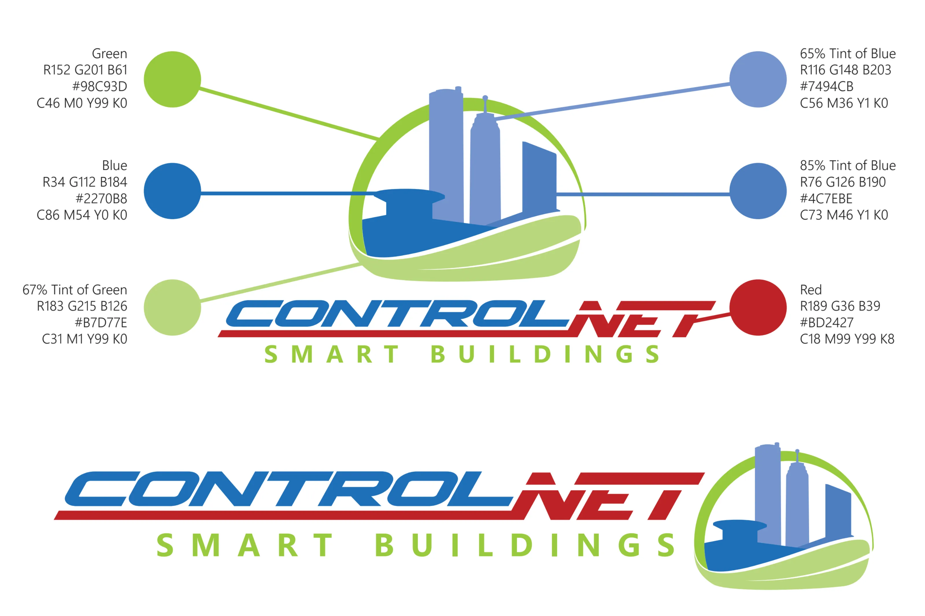
Updated the digital controls company logo to reflect their regional presence while staying true to its origins.
Project Details
Project Gallery


Project Details
I was tasked with updating the brand after nearly ten years, during a period when the company had expanded to multiple locations. To visually represent this growth, I explored ways to integrate elements from each city into the logo. Ultimately, I designed a unique skyline that incorporated recognizable landmarks from all the company’s locations, creating a distinctive and meaningful identity that reflected both their regional presence and their position within the controls industry.
Contributors
- Chris Brown
Team lead that managed brand consistency and main architecture.
- Scott Shoals
Design peer that helped with brand consistency and content.
Obstacles
Key challenges faced during the project development
- Building on the current logo
- Extending current brand colors
- Designing new iconography
Retrospective
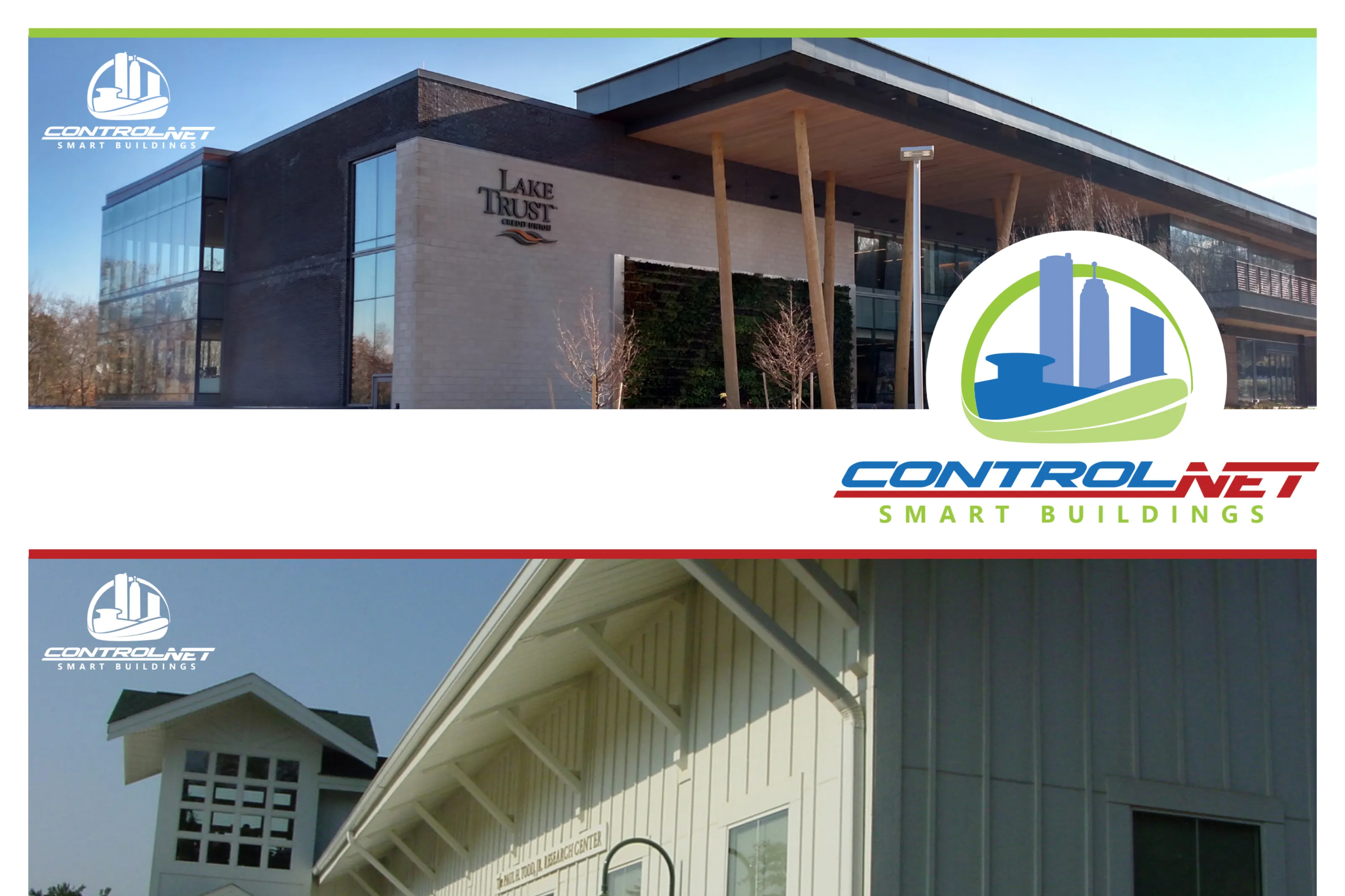
Interacting and incorporating the new logo into digital and print materials was an engaging and rewarding experience. I enjoyed exploring multiple logo iterations to refine the iconography and identify a solution that best represented the company’s identity.
Hard Skills
Technical and design skills utilized in this project
- Brand Strategy
- Brand Guidelines
- Color Theory
- Layout Design
- Logo Design
- Typography
- Vector Illustration